by Todd Leban | Apr 14, 2014 | FEATURE, Featured Articles, Todd L
Love, Faith, & Magic. The mobile art of Erin Leight by Todd L
“What is soul? It’s like electricity – we don’t really know what it is, but it’s a force that can light a room.” – Ray Charles.
This quote, like many others, accompanies the work of Pennsylvania mobile artist Erin Leight. Her eye for composition, combined with her ability to reach us on an emotional level, imbues her work with soul, and is presented with sincerity. Whether the subject matter is landscape, architecture, or still life, she has passion & patience, and accents the greater aspects of humankind.
I had the pleasure of getting to know Erin and ask her few questions about herself and her mobile photography. Here is her story.

Todd: Would you mind sharing a little bit about yourself, including how you got your start with mobile photography?
Erin: Since an early age, I’ve always felt it wasn’t truly a good day unless I created something new. My fascination with type began when my parents gave me a calligraphy set at the age of 8. I wrote and illustrated stories from an early age and realized how words could enhance an image, and vice versa. I collected strange and interesting trinkets and arranged them in still lifes just because it was satisfying. When I look back on my childhood, I realize it was the precursor for what I now do with my mobile photography.
I was formally trained in journalism and advertising copywriting. I saw it as a way for my creativity to be profitable. I wrote scripts for print, radio and tv ads and did voiceover work for a few years before realizing my heart was more in the creative design aspect of advertising. I bought a Mac, taught myself the basics of design and jumped headlong into freelance graphic design. Over the past four years I’ve built a successful custom wedding stationery design business.
As far as my introduction to mobile photography, a little over two years ago a friend said, “I found a great app you should try. Do you take a lot of pictures with your phone?” My answer was a firm, “No.” I downloaded the app anyway and was immediately pulled in by the concept of random and spontaneous creativity that could be instantly shared. Aside from one class in college, I had never dabbled in photography so I was a virtual newcomer to the genre when I began focussing on mobile photography.
I backed away from advertising copywriting because I felt there was a certain level of manipulation involved that I didn’t feel entirely comfortable with. I’m still drawn to the idea that reaching a target market is like solving a puzzle. But I feel like mobile photography allows an opportunity to connect with an audience through emotion and common interests… and allows one to make that connection with a modicum of soul and authenticity. I painstakingly labor over each shot with the hope that what I’ve created will touch people and be meaningful to them.
A Quiet Little Moment Hovering Between Winter and Fall
Todd: How would you say your style has evolved since the very first image you shared?
Erin: I rarely look back at my early Instagram posts, but your question prompted me to revisit and analyze a bit. I seemed to be concerned with composition from the beginning but I was all over the place stylistically. I edited only with IG filters for my first few months… so my style was very raw, primitive and exploratory at best. I snapped what I saw and tried to make it work.
I think my style has evolved to be a bit more refined and focused, with the intent behind each post being that I present something unique to the viewer. If I snap a shot, look at it and think “anyone could snap and post this shot,” then I don’t want to post it. There needs to be an element of something that’s uniquely “my world” in each shot, or it feels somehow unauthentic and unsatisfying to me.
There is not a Sprig of Grass that Shoots Uninteresting to me- Thomas Jefferson
Todd: How do you select objects to feature in your photos?
Erin: I always want the objects to have a little bit of soul, history and meaning to them… an air of timelessness. When I’m doing a word collage, I choose objects that fit the timeless mold, conceptually work and just feel right in the flow of the space.

Time is dead as long as it is being clicked off by little wheels; only when the clock stops does time come to life.” – William Faulkner
Todd: Your images are often accompanied by quotations. How do those quotes play into the process of creating an image? Does the quote influence the image, or is it the other way around?
Erin: I always create the image first and seek out words that enhance the meaning of the photo and represent my mood at the time I worked on the shot. If I feel like an image is traditional or bordering on mundane, I tend to put pressure on myself to find words that will lend weight or a deeper meaning to the shot. (I think one of the best examples of making my caption work to fit the image is “Love” in which the V is a wishbone.)
Love is measured yet organic, wishful yet wise. Love is about the grand scheme but, even more so, about the details.”
Todd: Although you’ve been focusing on still life more recently, your gallery consists of a great deal of nature and architectural shots. Did they become the catalyst/inspiration for later still life?
Erin: I appreciate the random beauty of nature and the orderliness of architecture. But each one is what it is. I began to feel less and less satisfaction out of shooting something that just is what it is and could be captured by anyone that chooses to shoot it. I get much more creative satisfaction out of manipulating natural and manmade objects to create a sort of orderly randomness.
“There are days when solitude is a heady wine that intoxicates you with freedom, others when it is a bitter tonic, and still others when it is a poison that makes you beat your head against the wall.” – Colette
Todd: You have a great command of the formal elements of art: line, shape, space, etc. In addition to being a designer, do you have a background in photography?
Erin: I took a basic art class in 8th grade, one introductory photography class in college, I’m a self-taught graphic designer and illustrator, so any command of the formal elements of art I’ve gained over the years has come from trial and error and sheer instinct. I think I approach photography with a designer’s sensibility. At the same time, I find that mobile photography is helping me refine my eye for detail in all areas of design. What I create through mobile photography combines all the things I love in design and is the most fun I’ve had over the course of my career.
")
“With faith and love anything is possible.”
The image above was created by Erin for a very special reason, and is a true example of the power of friendship and community. To find out more please view this link on Instagram and consider making a contribution.

“Where the spirit does not work with the hand there is no art.” – Leonardo da Vinci
Todd: What are your plans for the future with mobile photography?
Erin: I’m developing a line of stationery using my still life and collage work. My plan is to take it one step further and, once photographed, create framed three dimensional assemblages of the collages.
I’ve started doing commissioned collage work for individuals, nonprofit organizations and businesses. To be able to combine several of my passions and interests and venture down a new career path is an exciting prospect to me.
I’m looking forward to an upcoming collage project for an extremely worthy cause, Watts of Love (@watts_of_love) a global solar lighting nonprofit providing sustainable lighting products to poverty stricken regions in order to vastly improve quality of life. wattsoflove.org
I’m also excited about a mobile photography collage project I just completed for a major printing company that will be revealed at the end of April.
First and foremost I want mobile photography to be a creative escape for me, but I do think mobile photography can bridge a gap between marketing/advertising and artistic expression.
“There’s a bit of magic in everything.” – Lou Reed
by Todd Leban | Apr 6, 2014 | Stories
Welcome to the fourth edition of the We Are Juxt 1000 Words Facebook Showcase! Over the past few months, we have seen the group grow and watched their inspiring work being posted daily. We are happy to be able to showcase some of the outstanding work that is being shared.
We Are Juxt believes that mobile photographers/ artists tell stories through the photographs/ images and art that represents their families, their environment, themselves. This is important because of the level of communication that is portrayed in imaging today.
We want to support the mobile arts community by having a place for artists to share, discuss, and critique (if requested by individual). These dialogues help the individuals and the community to grow.
We look forward to you and your art. We thank you for your contribution to the mobile photography/ arts community. To submit your work click here.
My selections for this month not only display a variety of textures, but a sense of atmosphere and depth. The artists brought forth this sense of atmosphere and depth through the use of composition, and a thoughtful editing process. Portraits, blended images that forge a new reality, and vacant landscapes all leave us wanting to know more. I had the pleasure of getting to know more about the stories and thought processes behind the images, and am excited to have the photographers share their stories with you. – Todd
“Violet” by Erika Carrillo
Instagram // Facebook
In this particular piece I used Superimpose to place the image on a violet background. For a second step to blend in the colors and variety, I used SnapSeed. Then, using iColorama, I was able to accent the image with Flow and Raise, and for texture and final blending of colors, I used Stackables and Mextures. As a result, I was able to acquire my vision of youth, via expression of magical coloration and aura, around the innocence of a child
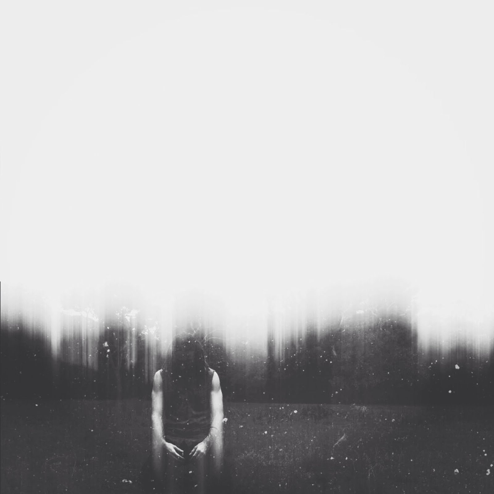
“?” by Andy Alexandre
Instagram
Apps used: Mpro – XnView – Afterlight – Mextures.
“I love improvisation when I take a pic, and I usually do not make many images with landscapes. This day I was alone in this park. It was the good moment. I tried to use the landscape and create the mood of a lost world.
I use Mpro for some b&w pics as I can play with contrast. To add this blur effect I used XnView, Retro 20 in Retro. I used afterlight to add more contrast in the sky and to have this gray atmosphere with “coal” filter. Finally, I used Mextures to add some scratch. I don’t really remember the filter, but you can find it in the folder grit and grain.
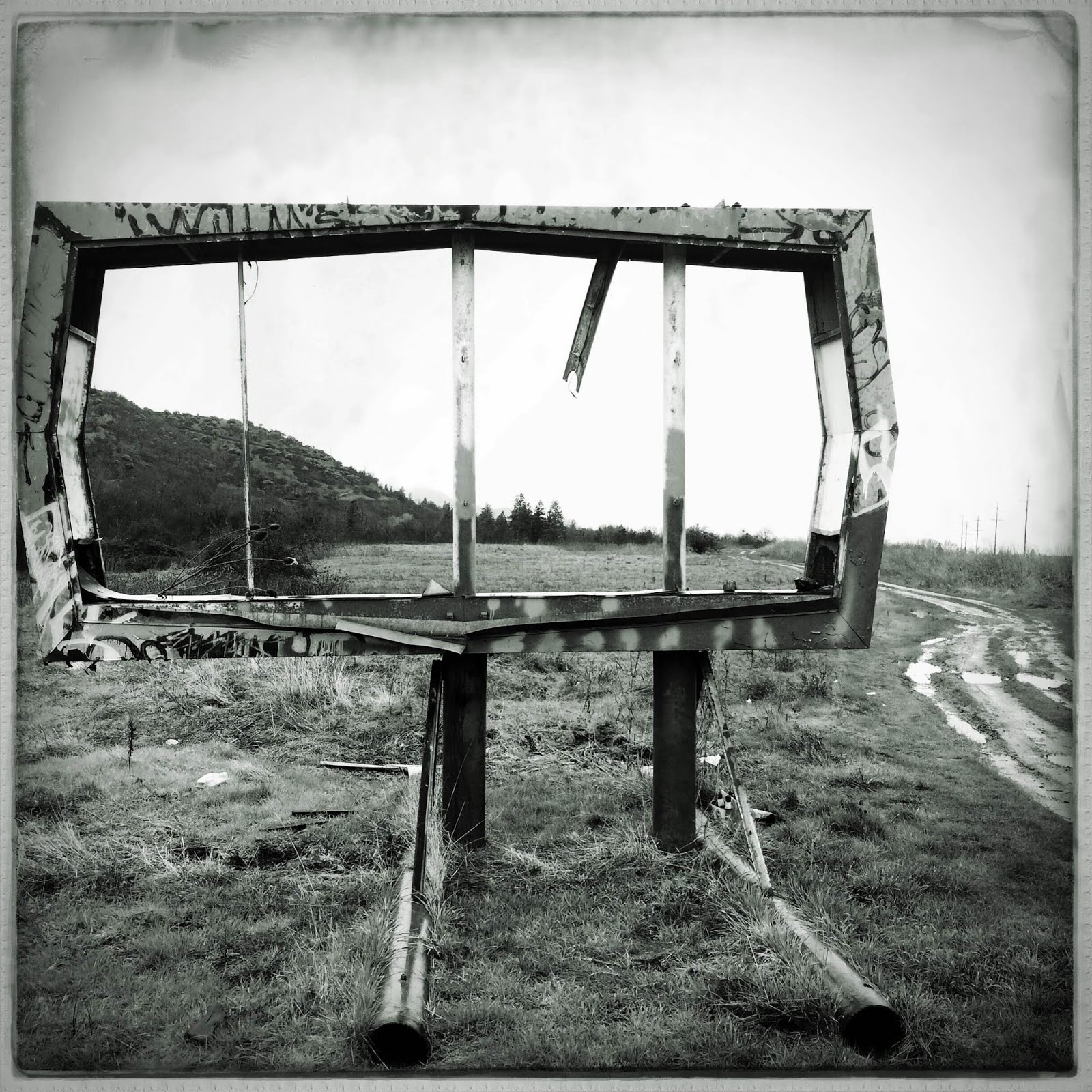
“Ashland, OR: Pay No Attention to the Man Behind the Curtain” by Meri Walker
EyeEm // Flickr // Twitter // Tumblr // Website
“Living in southern Oregon is a paradoxical experience for me. On one hand, this part of the northwest is sparsely settled and naturally beautiful. Ashland is famous for its wonderful restaurants and shops and, of course, the Oregon Shakespeare Festival. Some highly educated people have moved up here from the Bay Area and there are interesting bookstores, lectures, and some good music to serve them and the thousands of tourists that flock here in the summer to see the plays. On the other hand, some pretty abject poverty surrounds the expensive tourist attractions. Few jobs that aren’t minimum wage. Lots of homeless people on the corners. Children living in the woods – without parents. And that’s just the way it is.
Because I was a photojournalist early in life, it’s impossible for me not to see all kinds of things. Even in tourist towns. For the close to seven years I’ve lived in this area, this dilapidated old sign has been part of the landscape as you approach Ashland from the northernmost exit off I5. Not exactly the kind of image Ashland wants for itself. Ironically, no one has bothered either to take the sign down or invest in the vacant land.
For years, I thought I would stop and shoot the scene. March 9th I did it. Late in the afternoon. Bleak light and mud everywhere. I shot with Clear Cam originally because it was pretty windy and I wanted to be sure to get a steady handheld frame. I took all the color out when I got home and used Oggl to square up the composition and add the muddy edge. Not satisfied with the feel of the neutral monochrome I got from Oggl, I used Monokrom to punch up the contrast and add a smidge of green drama to the black-and-white.”
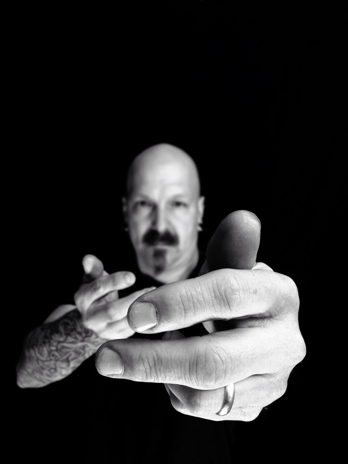
“Within Reach” by Jeffrey Simpson
Facebook // Flickr // Instagram // Website
“The inspiration for this shot, like most of my work is pretty simple. A strong black and white self portrait to capture and express all that feels just within ‘arms reach’ for me. Even though it’s not all clear (me, slightly out of focus), I keep a steady gaze, arms reaching and ever ready.
Process…
This self portrait is a pretty typical edit for me and feel it captures both me and my style of work. I have a ‘less is more’ approach with the apps I use, to achieve the classic black and white look that I love. I shoot in Pure Shot, which allows me to keep a high file size because it is in tiff format. (some apps really kill the file size!) I then used Filterstorm to convert to black and white. Filterstorm has a great ‘curves’ feature with a dynamic range of contrast and in this portrait, I really brightened the brights and darkened the darks. I also used the Blur tool to enhance the depth of field.

“Pond In Winter” by Paul Cutright
Facebook // Flickr // Tumblr // Twitter // Website
My inspiration for this image to begin with was visiting this pond. It is beyond some trees in our back yard and we can only see the pond when the trees are bare of leaves. It is in a hollow on our neighbor’s property and from our back deck it kind of glows in the shadow of the trees and surrounding hillside.
When I was at the pond it was small and surrounded by a lot of undergrowth as you can probably see in the image. I just knew that this scene could be the makings for an interestingly mysterious image. But, I wouldn’t know for sure or what the image would be like until I started working on the photograph.
I don’t usually have a preconceived idea of what I want an image to look like when I am done. I work intuitively, experimenting until I get something with which I am pleased. I like to create images that are mysterious, ambiguous and pull the viewer in to wonder and find their own meanings and interpretations beyond the literal. I also like to create painterly images in a painterly, impressionistic style.
I shot the image with Hipstamatic, Yoona lens & Blanko film, and edited it first in Snapseed. Then I opened it in DistressedFX and finished it there. I don’t usually document each step of the process when working on an image, so I can’t always give a step-by-step explanation of what I have done. I used to do that when I first started with iPhone photography, but found it slowed me down and interrupted my “in the moment” inspirations. All images and editing are done on my iPhone 4s.”
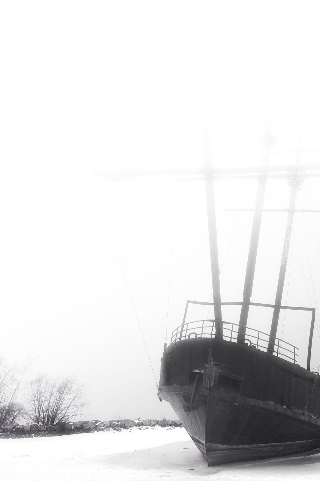
“Departure” by Anthony Hutchinson
Facebook // Flickr // Google+ // Twitter // 500px
“This ship was abandoned about ten years ago along the shores of Lake Ontario. Apparently it is a replica of the “Grand Hermie” used by the famous French explorer Jacques Cartier during his explorations of Canada between 1535 and 1542. Living in Toronto I have made numerous trips to Niagara Falls where you can clearly see this ship from the highway, but I never had the opportunity to stop and explore it until I finally decided to make a special trip. During the winter, because of the frozen shallow water it is standing in, you can get right on the ship and I therefore had the opportunity to explore it from every angle. It was a very rewarding hour I spent, including having to run back to the car to recharge my phone! (And I have to thank my wife as she patiently waited for me). Given that it is only a replica of a historic ship, it does’t have a lot of stories to tell, but you still can’t help but wonder what life must have been like for the original explorers on a ship such as this. How did they survive the harsh conditions of sailing such a small ship across the Atlantic to a land they had never been to, known then only as “The New Word”, not knowing what they would encounter? You can’t help but think about what stories the original sailors would have told. It’s all somewhat eerie.
This image was processed in Leonardo and Handy Photo, and because of the minimalistic nature of this image, processing was fairly straight forward. I use Leonardo almost exclusively for the bulk of my processing because I like to work with multiple layers and masking of details. After converting to black & white within Leonardo, I first went about adjusting contrast and brightness in specific areas of the image and in particular I wanted to bring out the contrast and depth of the rocks in the background and darken the ship. Fog was then added using Handy Photo. I had to play with this quite a bit to get it just the way I wanted it. The reason for adding the fog was not only an esthetic one but for me it was a way of emphasizing the “mystery” of not only the ship, but the mystery the original sailors must have felt when heading off for the New World.
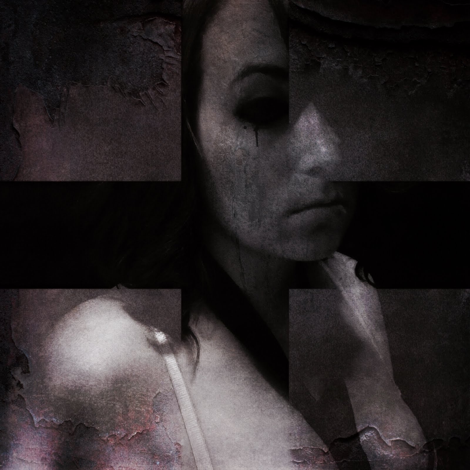
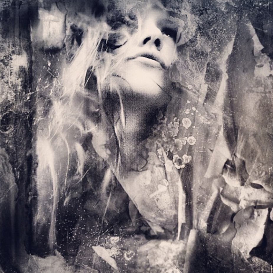
“Behind These Walls” by Ginger Lucero
AMPtCommunity // Flickr // Instagram
-Behind These Walls-
Tattered and torn in the state of confusion, she hides behind these walls, it’s just an illusion.
She puts on a brave face and takes cover behind her smile, she’ll tell you she’s okay, but is dying all the while.
It’s not the first time he’s made her feel this way, her happiness depends on his mood, for it changes every day.
He’ll tell her he’s sorry and didn’t mean to cause her any pain, and she’ll tolerate his lies so others won’t think she’s insane.
But the walls are crumbling down, the sheet rock is wearing thin, and soon she will see that this is the beginning of the end.
She can’t take it any more, for it’s all just too strong, she’s beginning to feel like she doesn’t belong.
Behind these walls all torn and tattered, a woman is being abused, a woman is being battered.
“When I created this image, there wasn’t any idea in mind. The inspiration for the image came after it was made. It spoke to me of abuse, abuse that is either physical, emotional or mental. The kind of abuse that no one should ever feel. Women, men, children – we all feel, we all matter.
The photo was taken using ProCamera7. Snapseed to make the image black and white.I then used Faded to get the squares in the corners. Added texture from Camera Awesome, and used Imageblender to blend the texture to the squares themselves. Repix for the black drip. Finally finished with Stackables for added grit and final touches.”
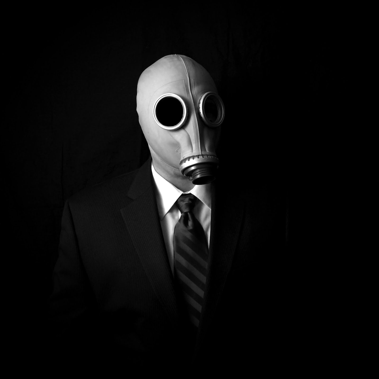
“Toxic” by Rob DePaolo
AMPtCommunity // EyeEm // Instagram // Website
“This image was created out of the synthesis of two different creative impulses on my part. On one hand, as anyone that has followed my work for a while will attest, I have a bit of a “thing” for photographing people (mostly myself) in various masks. There’s something about how the wearing of a physical mask calls attention to the fact that we are all wearing “masks” of some sort throughout most of our lives. On the other hand, I also set out to make a statement about working life and how, for so many people, the corporate environment is a toxic one, and the mask (notice it’s missing a filter) represents our honorable, yet ineffective attempts to shield ourselves from the “toxins” that we are exposed to daily.
Like most of my mobile work these days, this image was shot with an iPhone 5s using PureShot in TIFF mode and edited exclusively with Filterstorm Neue (preserving the image file as a TIFF throughout the entire process). As far as the editing process, it is actually quite simple. I cropped the image square, converted to B&W, blacked out the eyes using the Curves feature of FS Neue along with the masking brush tool, then tweaked the overall contrast and brightness, added some heavy vignetting, and that’s about it.
“Blue Hotel” by Emma Amar
EyeEm // Facebook // Instagram
I was taking my self-portrait with the native camera on the iPhone4S, with stand by. I also took a pic from my city Cannes (french riviera) with the hipstamatic combo Jane and BlacKeys supergrain. Then I tuned the image in Diana to make a blend. I chose the filter ‘rave on’ and that’s it. I love to try different apps. It depends on the mood of the day. Thanks again to wearejuxt for helping me to find inspiration.
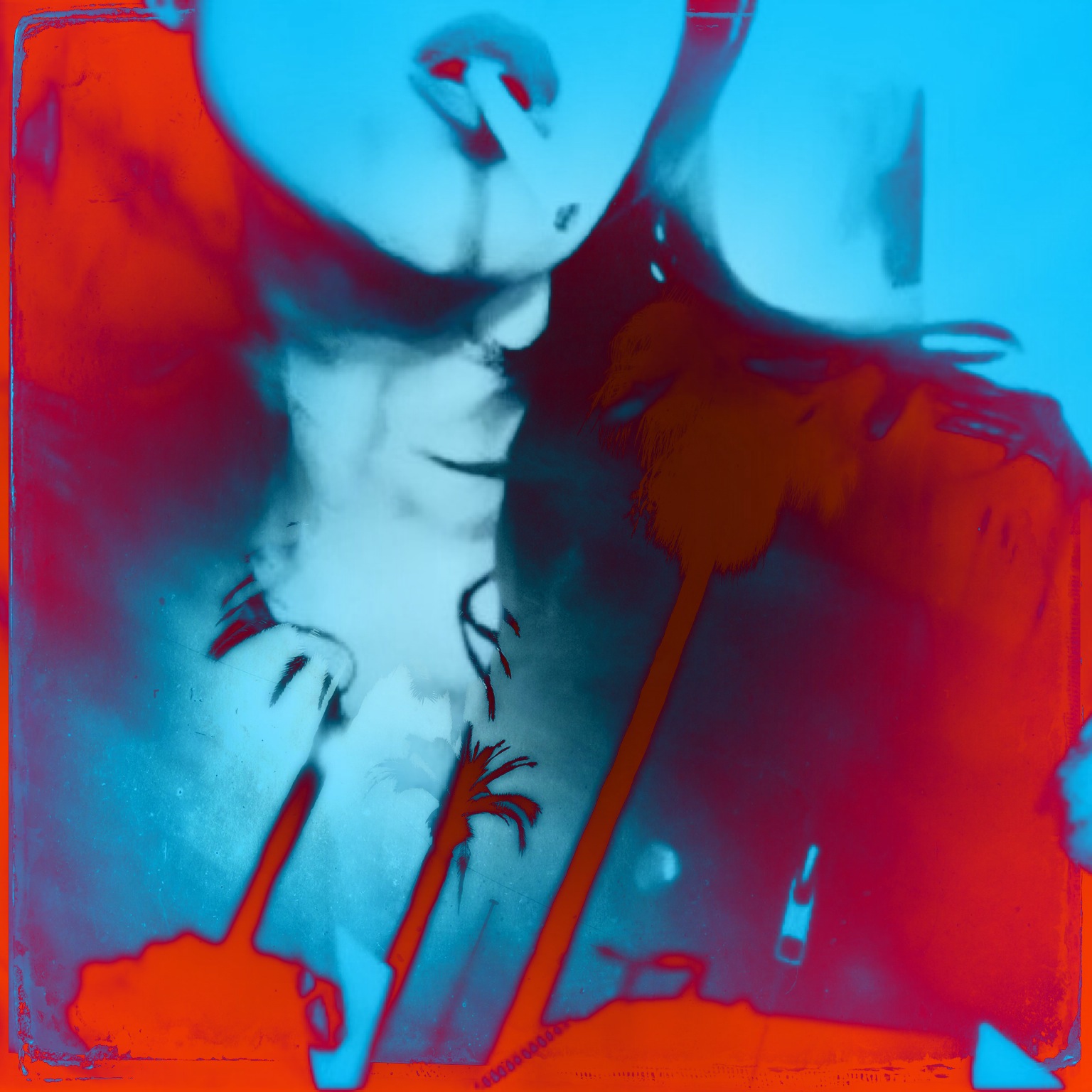
“Untold Blasphemy” by Ioannis Sidiropoulos
Facebook // Flickr // Instagram
“Untold Blasphemy is the result of a challenge that I’ve put myself to do – edit with more of a romantic touch than my usually dark edits. The apps that I used are blender to blend the main subject that is the portrait with other images like flowers, walls, woods etc. and the result is that. I used iRetouch to crop the image, and I used filterstorm to adjust the contrast.”


