Welcome back to the Juxt school house class!
I hope you had a good couple weeks shooting negative space and learning the relationship between your subject and the area around it. Negative space can be really fun to shoot-if it’s not fun it’s not worth doing.
So this week we are going to embark upon a trek through the elements of design. We are only going to talk about a couple today. Wouldn’t want to bore you, now would I? The elements we are going to chat about over the next few weeks are light, lines, texture, shapes, and perspective. We have already spoken about lines but we will breifly come back to them just as a reminder.
So which one to choose for today?
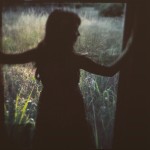
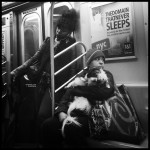
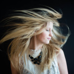
I think light. If you know me you know I am a sucker for dramtic light. I really don’t think there is any thing more fabulous as inky blacks contrasting against color. Sigh. It’s just so good.

Without light (and I think this probably goes without saying) we couldn’t have lines and shapes to photograph. Depending on when you shoot the light will create different hues of color. Depending on what type of contrast or mood you want to communicate to the viewer will be dependant on the light. Granted, you can change all of this post procesing but it is wise to consider all of this before hand.

Speaking of contrast, light also creates contrast within a compostion. You can make it as dramtatic as you want but be careful to not detract from the subject. Contrast in colors can create a very dramatic compostion.

About Author
Latest stories
 Featured ArticlesApril 13, 2015The Storytellers Vol. 4
 StoriesMarch 3, 2015Momdom
 Anna CoxFebruary 24, 2015Captain and the Kid
 Anna CoxJanuary 19, 2015Honest Moments by Caleb Stumpfl
