Welcome to the 11th 1000 words Facebook showcase
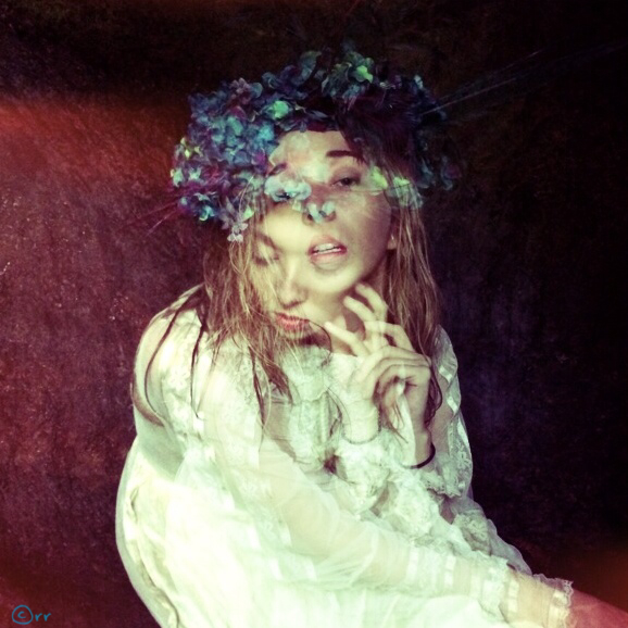
Inspiration for this 1st image is easy , I was in Maui on a Brooke Shaden retreat. Our model Marsha Denlinger, was in a wonderful cave posing for fellow photographer Maureen Sullivan aka Wandering Alice that was setting up a conceptual shot around a beautiful head dress made on the Island ( which by the way you can support Hawaiian artists and find this one on Etsy called “Hat and Mouse” )
i was behind the scene and shot this in Hipstamatic using the Chunky lens and Ina’s 1969 film flash off with the double exposure mode on. The editing i did was minimal opening it in Snappseed and cropped the frame out, i usually hit automatic and let the app correct contrast for me but in this case it changes the color to much so i left it, hit detail and sharpening a bit. I sign in title fx.
Unfortunately, my friend Eric Rosen let me know that the little thingy to the left of the lens is res, high med and low !
I love it but Im not Hipstmatic savy, and the film and lens were chosen by the app… The setting seem to switch setting on me,
( which i JUST learned how to save favorites ) I use to get mad, when it would change on its own, but now i am plesently surprised on a lot of shots in which i would have never chosen that film or lens.
website // flikr // instagram // facebook //
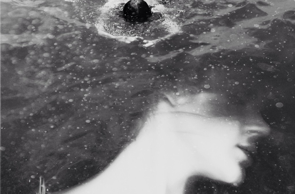
First of all, thank you very much Todd and GRRYO for featuring my Work.
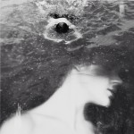
The image that you have selected has been inspired by the lack that I tried in a moment of distance from my partner. I took this image of him while he was swimming in water (made this summer in a short and happy escape to the sea). I love ‘clean’ and ‘pure’ photographs, but sometimes it happens to me to feel the desire to stratify, to abstractify to make photograph like a multidimensional object, dreamlike. That’s why I sometimes lean towards a kind of photo manipulation. So, as often happens, I felt the need to add something to this photo, maintaining the formal structure of the original image. Based on what I felt at that moment, I had the idea to superimpose a relatively old self-portrait.
Shots were both done with my IPhone.
The editing is quite simple: I only have used image blender and analog film apps. Image blender for the superimposition, analog film to apply a bw filter, adjust exposition, contrast and to add some grain to emphasize the foam of the sea. Also to confuse a little the definition of the image. I Like the fact that you can’t recognize specifically a person and this fact allow everyone’s imagination to flow free and make his own story.
// instagram // Flickr //
Diana Nicholette Jeon
they can only succeed by silencing our voices
iPhoneography/Mobile Art
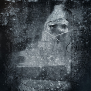
Composite of 4 images with a lot of drawing/painting in Procreate and iColorama.
This work is in response to the idiotic pronouncement of Satya Nadella that was affront to working women everywhere.
Recently I was working on a series of images, and I got stuck…It wasn’t going the place I saw in my mind, and since it was part of a larger series, I needed to maintain a certain ”look and feel” to the work. As is often the case, I put it aside so I could come back to the work with fresh eyes. I started on a different series.
As I was working on the second Image of the newer series, I read this article: http://readwrite.com/2014/10/09/nadella-women-dont-ask-for-raise. The male CEO of Microsoft was telling women that they should not ask for raises. “Karma” would take care of that for them. I used to work in high tech in the Silicon Valley, and found that it was enough of boy’s club that reading this made my blood boil!
I posted about it on Facebook. I told my husband and son at dinner. I got barely a nod about it. We went to dinner the next night for a birthday, and there were three women at the table with us. I showed the article to them, and they were as mad as I was. I knew I wasn’t alone, and I was sure I wasn’t crazy.
I went home that night and created this work. The woman’s face is composited via three self portraits of myself. I used a heavily textured shot positioned so that part of it would be similar to a noose. I crossed out her mouth. I work with black, for mourning. I was seeking a dense dark look, like an aquatint intaglio print or a mezzotint work.
I used iPhone 5s native camera to shoot the images of my face, and worked the image back and forth using iColorama, Procreate, PS Touch, Photoshop Mix, Pixel Blender, Diana, Mextures, Stackables, Scratch Cam, Stackables to create it. The process was fast but very involved. I rarely use only one or two apps. I go into and out of apps rapidly, taking what I need for this or that, and moving on to the next, then maybe back again. I have been working with digital tools for art practice since 1997, so using apps is, for me, like using different features in Photoshop. It is second nature. I don’t think about the apps, I just move from one to the next as I need.
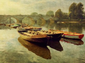
I live 5 minutes walk from the river close to Richmond. A couple of mornings a week I go out walking along the river with a friend of mine and a couple of doggies. We set off approximately 8.15am so we have been getting lovely light on the riverside. On this particular morning the water was very still and produced beautiful reflections of the boats. I took the photo with VividHDR using the Lively preset. I then opened the photo in Snapseed, cropped it and applied a few minor adjustments. Then I took it into PhotoCopier which gives me the option of so many wonderful effects and textures. I bought a new app Brushstroke so this was my first time using it. Loved the painterly look I got! Then my last app I used was DistressedFX where I applied the Charm preset.
Instagram // Twitter // Flickr
About Author
Latest stories
 StoriesJanuary 12, 2015What’s In a Name? Vol 2
 1000 WordsNovember 2, 20141000 Words Facebook Showcase Vol. 11
 1000 WordsAugust 31, 20141000 Words Facebook Showcase Vol. 9
 StoriesAugust 1, 2014What’s In A Name? Vol 1

