by Todd Leban | Nov 2, 2014 | 1000 Words, Stories, Todd Leban
Welcome to the 11th 1000 words Facebook showcase

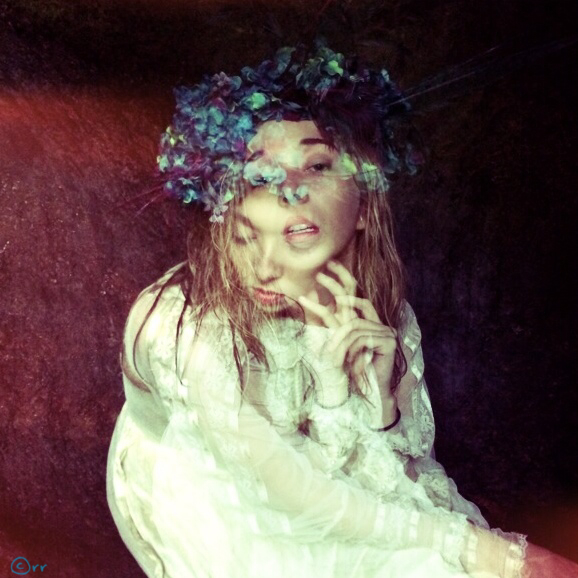
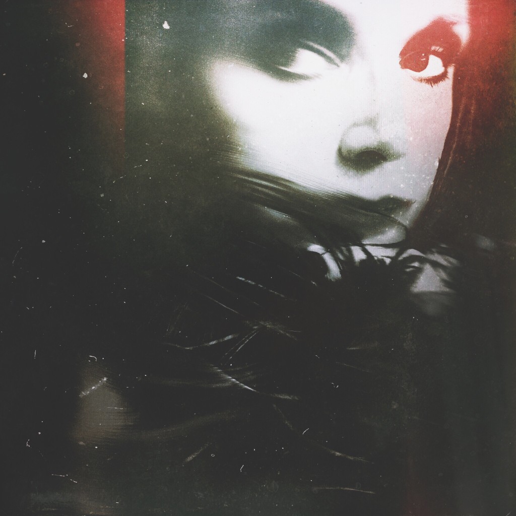
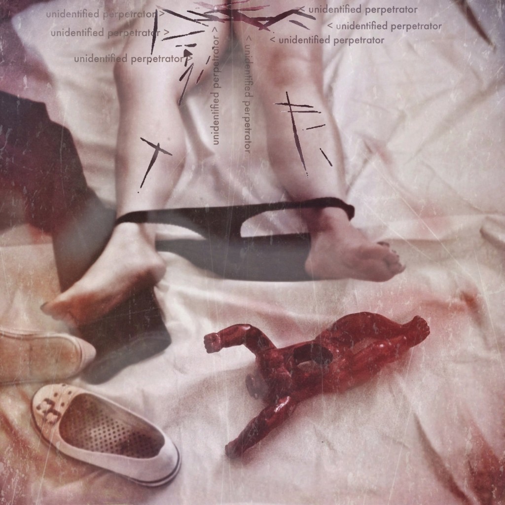
Inspiration for this 1st image is easy , I was in Maui on a Brooke Shaden retreat. Our model Marsha Denlinger, was in a wonderful cave posing for fellow photographer Maureen Sullivan aka Wandering Alice that was setting up a conceptual shot around a beautiful head dress made on the Island ( which by the way you can support Hawaiian artists and find this one on Etsy called “Hat and Mouse” )
i was behind the scene and shot this in Hipstamatic using the Chunky lens and Ina’s 1969 film flash off with the double exposure mode on. The editing i did was minimal opening it in Snappseed and cropped the frame out, i usually hit automatic and let the app correct contrast for me but in this case it changes the color to much so i left it, hit detail and sharpening a bit. I sign in title fx.
Unfortunately, my friend Eric Rosen let me know that the little thingy to the left of the lens is res, high med and low !
I love it but Im not Hipstmatic savy, and the film and lens were chosen by the app… The setting seem to switch setting on me,
( which i JUST learned how to save favorites ) I use to get mad, when it would change on its own, but now i am plesently surprised on a lot of shots in which i would have never chosen that film or lens.
website // flikr // instagram // facebook //

First of all, thank you very much Todd and GRRYO for featuring my Work.
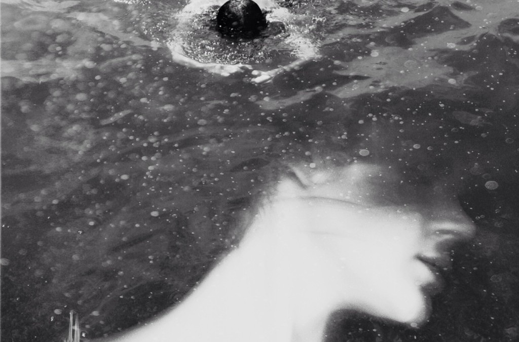
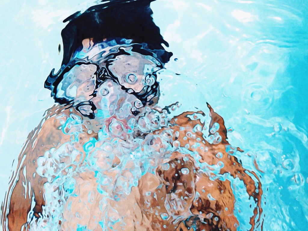
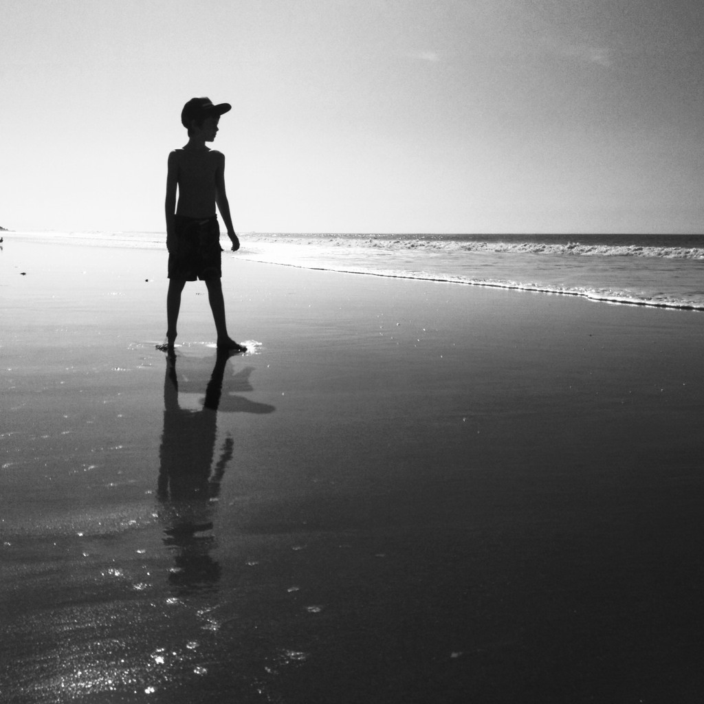
The image that you have selected has been inspired by the lack that I tried in a moment of distance from my partner. I took this image of him while he was swimming in water (made this summer in a short and happy escape to the sea). I love ‘clean’ and ‘pure’ photographs, but sometimes it happens to me to feel the desire to stratify, to abstractify to make photograph like a multidimensional object, dreamlike. That’s why I sometimes lean towards a kind of photo manipulation. So, as often happens, I felt the need to add something to this photo, maintaining the formal structure of the original image. Based on what I felt at that moment, I had the idea to superimpose a relatively old self-portrait.
Shots were both done with my IPhone.
The editing is quite simple: I only have used image blender and analog film apps. Image blender for the superimposition, analog film to apply a bw filter, adjust exposition, contrast and to add some grain to emphasize the foam of the sea. Also to confuse a little the definition of the image. I Like the fact that you can’t recognize specifically a person and this fact allow everyone’s imagination to flow free and make his own story.
// instagram // Flickr //


Diana Nicholette Jeon
they can only succeed by silencing our voices
iPhoneography/Mobile Art
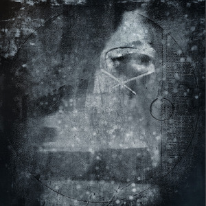
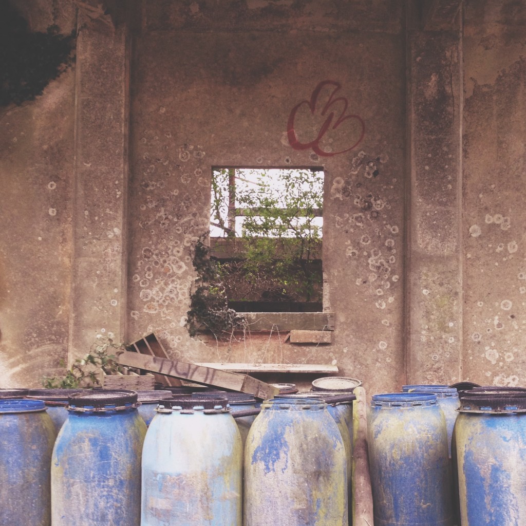
Composite of 4 images with a lot of drawing/painting in Procreate and iColorama.
This work is in response to the idiotic pronouncement of Satya Nadella that was affront to working women everywhere.
Recently I was working on a series of images, and I got stuck…It wasn’t going the place I saw in my mind, and since it was part of a larger series, I needed to maintain a certain ”look and feel” to the work. As is often the case, I put it aside so I could come back to the work with fresh eyes. I started on a different series.
As I was working on the second Image of the newer series, I read this article: http://readwrite.com/2014/10/09/nadella-women-dont-ask-for-raise. The male CEO of Microsoft was telling women that they should not ask for raises. “Karma” would take care of that for them. I used to work in high tech in the Silicon Valley, and found that it was enough of boy’s club that reading this made my blood boil!
I posted about it on Facebook. I told my husband and son at dinner. I got barely a nod about it. We went to dinner the next night for a birthday, and there were three women at the table with us. I showed the article to them, and they were as mad as I was. I knew I wasn’t alone, and I was sure I wasn’t crazy.
I went home that night and created this work. The woman’s face is composited via three self portraits of myself. I used a heavily textured shot positioned so that part of it would be similar to a noose. I crossed out her mouth. I work with black, for mourning. I was seeking a dense dark look, like an aquatint intaglio print or a mezzotint work.
I used iPhone 5s native camera to shoot the images of my face, and worked the image back and forth using iColorama, Procreate, PS Touch, Photoshop Mix, Pixel Blender, Diana, Mextures, Stackables, Scratch Cam, Stackables to create it. The process was fast but very involved. I rarely use only one or two apps. I go into and out of apps rapidly, taking what I need for this or that, and moving on to the next, then maybe back again. I have been working with digital tools for art practice since 1997, so using apps is, for me, like using different features in Photoshop. It is second nature. I don’t think about the apps, I just move from one to the next as I need.
FB // art // web // flickr //

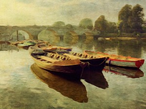
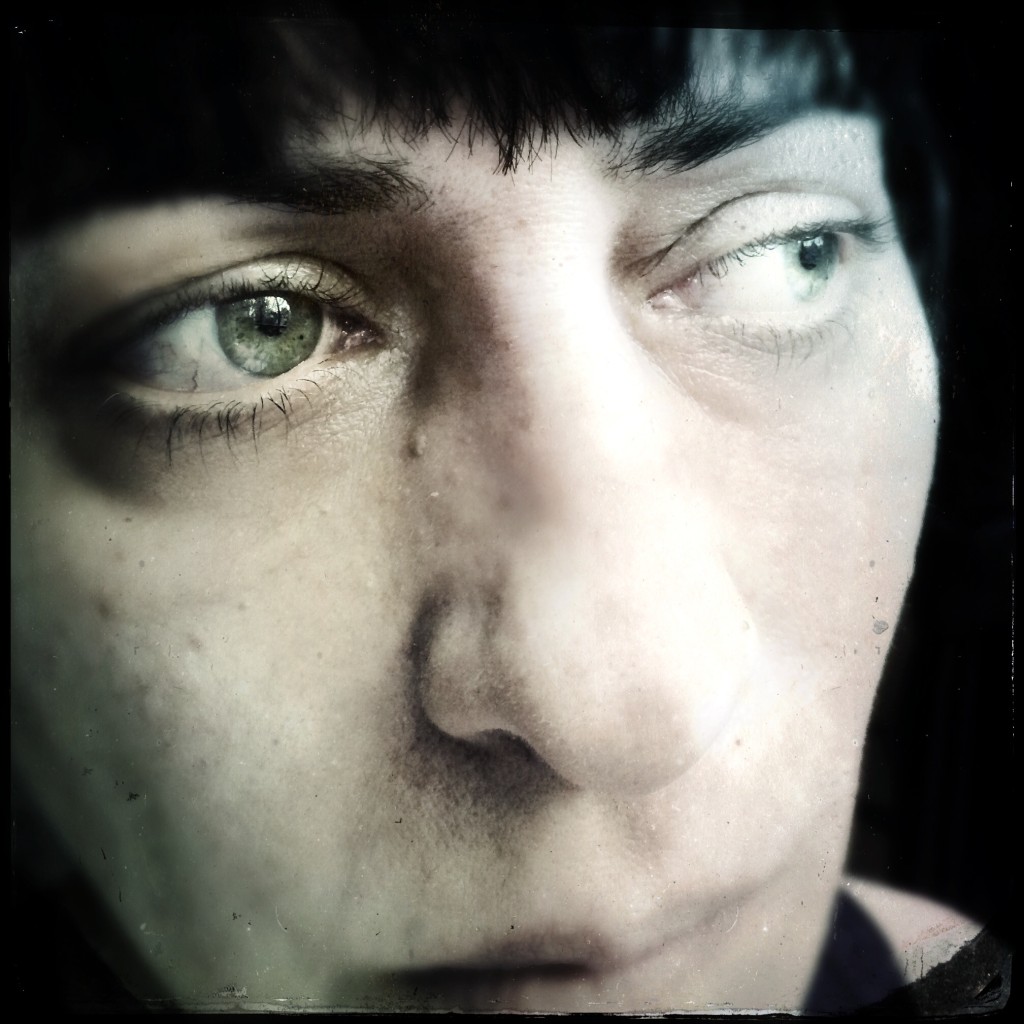
I live 5 minutes walk from the river close to Richmond. A couple of mornings a week I go out walking along the river with a friend of mine and a couple of doggies. We set off approximately 8.15am so we have been getting lovely light on the riverside. On this particular morning the water was very still and produced beautiful reflections of the boats. I took the photo with VividHDR using the Lively preset. I then opened the photo in Snapseed, cropped it and applied a few minor adjustments. Then I took it into PhotoCopier which gives me the option of so many wonderful effects and textures. I bought a new app Brushstroke so this was my first time using it. Loved the painterly look I got! Then my last app I used was DistressedFX where I applied the Charm preset.
Instagram // Twitter // Flickr

by Todd Leban | Aug 31, 2014 | 1000 Words, Stories, Todd Leban
Welcome to the ninth edition of the GRRYO 1000 Words Facebook Showcase! Since the creation of the Facebook group, we have seen it grow and watched inspiring work being posted daily. We are happy to be able to showcase some of the outstanding work that is being shared.
GRRYO believes that mobile photographers/ artists tell stories through the photographs/ images and art that represents their families, their environment, themselves. This is important because of the level of communication that is portrayed in imaging today.
We want to support the mobile arts community by having a place for artists to share, discuss, and critique (if requested by individual). These dialogues help the individuals and the community to grow.
We look forward to you and your art. We thank you for your contribution to the mobile photography/ arts community. To submit your work click here.

Veronica Hassell
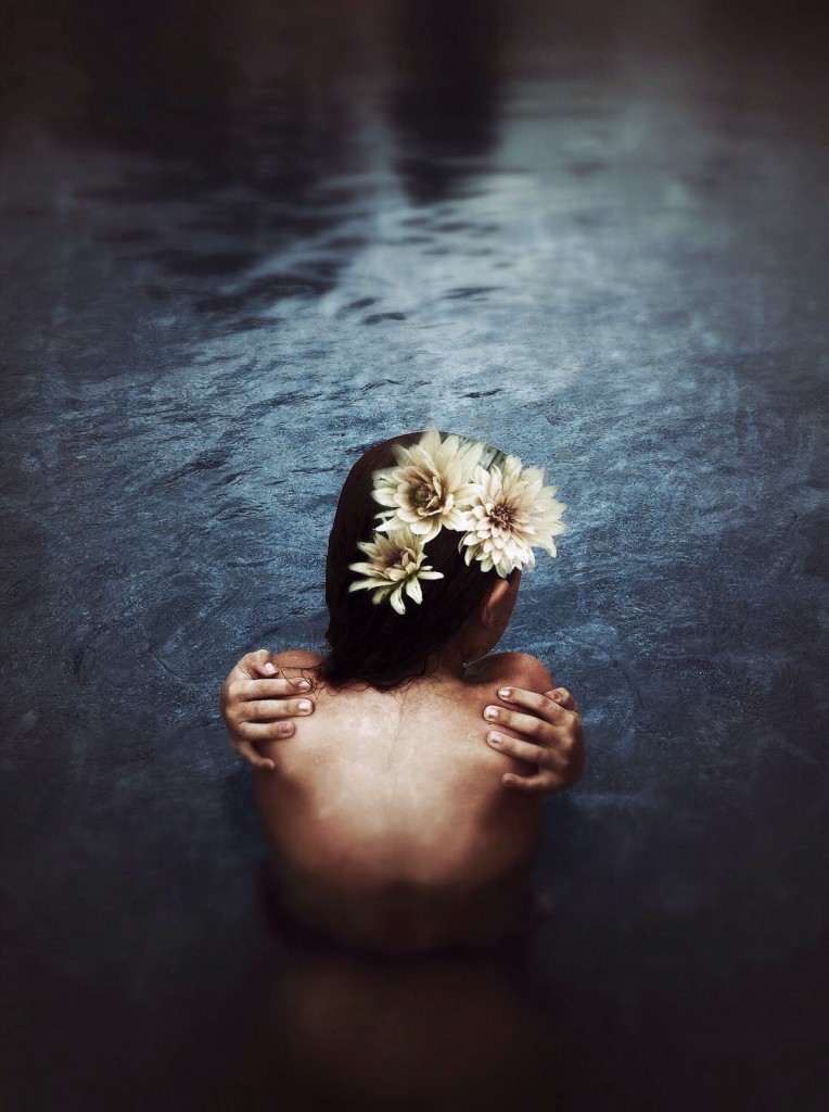
I have been exploring the water element this summer with my lifeproof shooting a lot of underwater shots and this was an afternoon when we just finished shooting. It was early evening and we were losing the last bit of natural light so as my model sat shivering, I decided to take a few more shots. I actually used the snappeed in app camera and used a preset in the grunge setting. I then used the tilt shift preset for some slight blur. Unionapp was used to add and blend the flowers, which I also shot in the snappeed camera and edited in grunge. This original shot was taken in a swimming pool with all those edges of the pool just beyond the models head in view. A little cropping and blending created more drama and the feel of some deep blue pool in Bali which is what I was hoping for.
This shot is part of a series on Flickr called “Skin Divers” which is from the writings of Anne Michaels.
I think as time goes by I’m realizing more and more that it doesn’t matter how many apps you use, sometimes beauty can be created with the most simple subject. It’s a challenge I’m enjoying quite a bit: finding beauty in simple moments.
// instagram // Flickr // Veronica Hassell//

Elaine Taylor
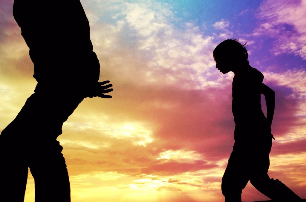
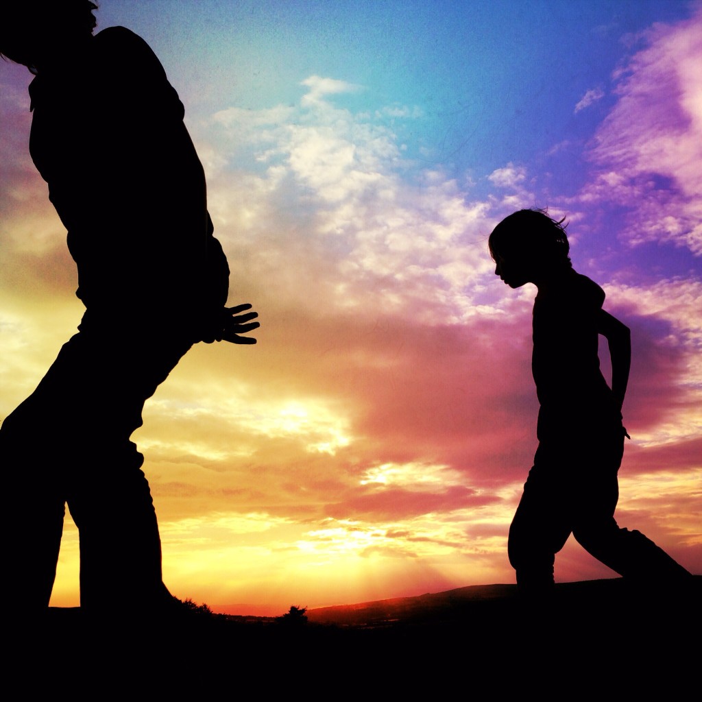
This shot was taken early Summer’s evening at one my boys’ favourite spots to play. A place where they automatically run, climb, jump and create little adventures together. No technology in sight (apart from my cheeky iPhone!). It’s what they enjoy doing more than anything. I love capturing those precious moments.
I took a few shots that evening. When I looked through the camera roll this one jumped out. I loved Billy’s hand; like he is beckoning his big brother. The original image felt a bit gloomy though, and didn’t reflect the actual moment captured. It seemed sad. Ominous. The boys with their heads down under a moody sky. It just didn’t feel right. So, I turned to Mextures to add something colourful to the sky; something uplifting.
My boys under a rainbow sky off on an adventure together to discover new and exciting things. That’s what I see when I look at this image.
Apps Used: Procamera7, Snapseed, Mextures, Union
Process:
I shot this with ProCamera7 on my iPhone5S. As I do with most images, I took it into Snapseed first: cropped and straightened it, then increased the contrast a little. Next step Mextures to create the rainbow colours in the sky (can’t remember the details – Mextures is still new to me so I would’ve been playing around for quite some time). Finally, I took the image into my favourite blending/masking app Union to bring out the original silhouettes.
Links:
// AMPT // Flickr // IG // EyeEm //

Erika C. Brothers
This image is one of hundreds I have taken of my kids this summer, in fact I could say that is my favorite of summer 2014. I really enjoy taking water photography and enjoy the results I get from the effects of water. This particular photograph was taken with the iPhone standard camera and edited on a iPad first using Camera+ to adjust contrast, after I used iColorama to highlight the effect of flow, and for final filter effects VSCOcam.
IG // FB //

Tommy Wallace
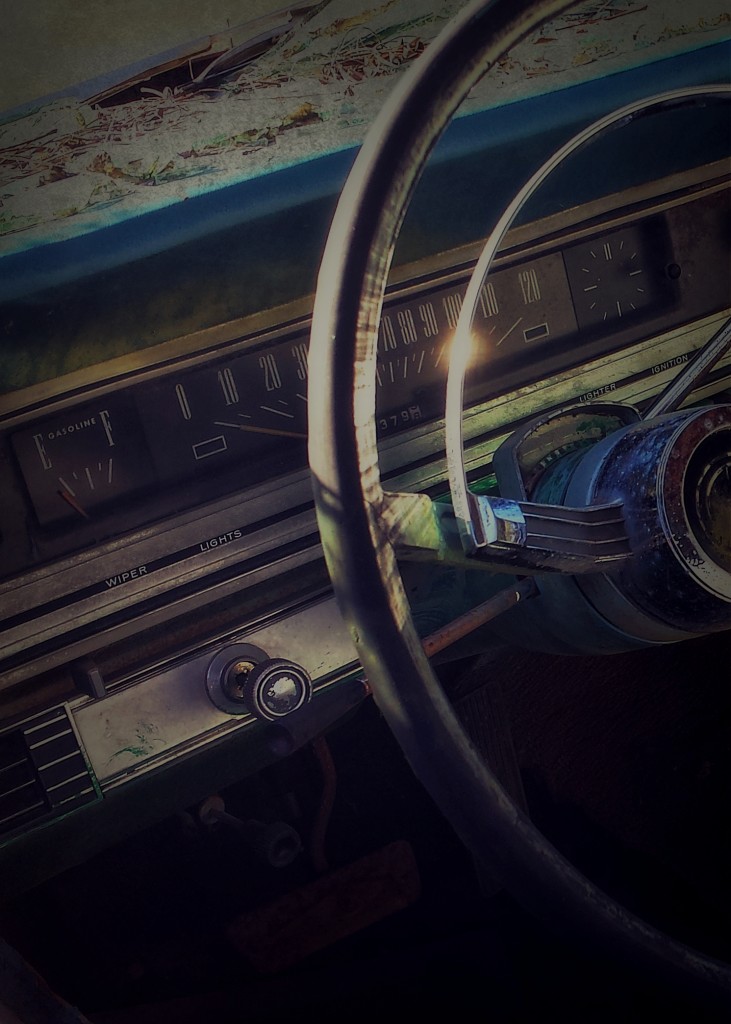
I don’t usually shoot cars yet here I was in the backyard of an abandoned farm house with three or four surrounding me. What was I to do? This shot was taken with the sun through the window giving a nice glint of light on the horn ring of the steering wheel.
Taken with the Camera-FV5 app on my Samsung GS4, I let this gem sit on my feed for months before I did anything with it. For editing I used HandyPhoto which is one of my favorite editing tools. This app is available on android and iOS.
It’s been awhile but I’m thinking on this one I first cropped then darkened the photo, while increasing contrast and sharpening slightly. I’ve really enjoyed working with textures and applied a few of them gently to get a darker effect and to give some vignette on the edges.
As I edited this I began to focus on the glow from the light reflected on that horn ring. I love the way the reflected light splashes across the steering wheel.
I try to title photos from personal experiences as well as something that is unique to the shot itself. The fuel gauge is setting on the “E” in this shot, of course. When I was growing up and started driving I learned a new phrase: “Flat on empty.” The car I drove was in that condition more often than not. As I’m old enough to have driven a car with a horn ring like this, I thought “Flat on E” was appropriate.
On Instagram, Eyeem, and Twitter I’m @pastortwallace. On Flickr just drop the @. You can also see some of my stuff at amptcommunity.com/profile/TommyWallace. I appreciate the opportunity to participate with the Grryo community. The storytelling aspect of photos is so powerful and I’m glad Grryo celebrates that.

Patricia Larson
Photo taken with iPhone 4s
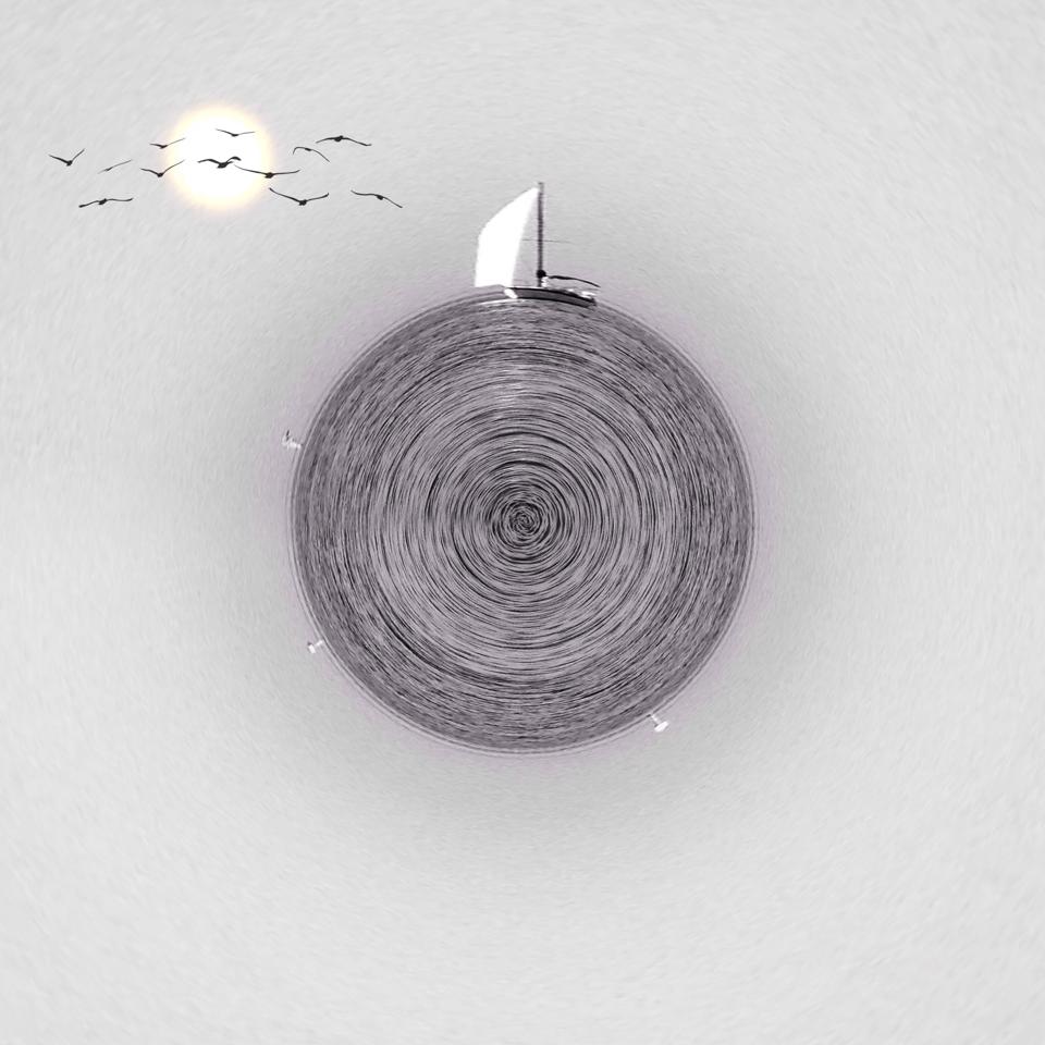
This photo was taken on a trip to a beach in Texas, the picture was completely minimalist so I decided to play with the editing, it was a beautiful evening and it was not time of vacation so that the sea was in complete tranquility and could perfectly capture the photo.
Apps Used: Camera+, Circular
Facebook // EyeEm // Flickr // IG // phoneart.com

Andrea Koerner
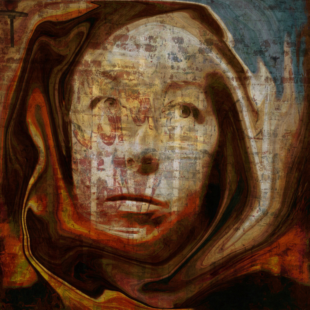
There really isn’t any inspiration per say behind my photos it’s more an intuitive thing that I do. I just start with a photo and “play” with various apps until I get a photo that speaks to me. This one started out as two Hipstamatic photos that I combined in Superimpose. I then added more elements thru Superimpose and put the finished photo thru Brushstroke(I painted it and upped the Saturation). From there I took it into Elasticam and manipulated it to give the figure the effect of wearing a hood/cowl. Lastly I took it into Textures+ and added the graffiti effect.
// Instagram // Flickr // Facebook //

by Todd Leban | Aug 1, 2014 | Stories, Todd Leban
What’s In A Name? Volume 1 curated by Todd Leban
Whether you are aiming to be creative, clever, humorous, emotional, or are simply identifying the elements of your shot, the title for your image is an important element that deserves some thought. In this first installment of an ongoing series, I have asked a handful of mobile photographers to select one of their photographs, and share their process of selecting its title. Please join me in discovering more about these artists and their images from around the globe.

Chuck Rose
Title of Image: My Reflection and a Piece of My Heart.
This picture is of my only son. I was thinking about how he will reflect some of who I am – that how I treat him and others will be reflected in the way that he treats people, and what a huge responsibility that is, and what an invaluable gift he is. It also made me think of how I want to be a reflection of God, my heavenly Father.
My process for naming an image generally happens one of two ways. I either have a thought in my head that I want to share, and look for or create an image to accompany it, OR I look at or create an image, and a thought comes to mind. One of my primary goals on Instagram, and in life is to encourage others. As I am thinking about a caption, I try and ask myself if the caption will in one way or another encourage those who see it – either by making them laugh, or making them think, or by sharing a part of who I am.
I know that some artists prefer not to use a caption….to allow the viewer to take what they want from the image. Though that is sometimes true for me, more often than not I want the caption to provide the viewer a deeper glimpse into some thought I had when creating the image.
AMPt // Instagram // Flickr // Twitter

Louise Fryer
Title of Image: Don’tcha Look Back
Naming an image is quite a new thing for me, until recently I believed that it was better to leave the perception of an image up to the viewer and not influence in any way. I am currently working on creative self portraits and especially for this genre, I find the images I create don’t seem finished until they have a title. Choosing a title is a very individual process and they can come from pretty much anywhere.
The images I’m concentrating on right now usually have some kind of emotional significance and sometimes I’ll find a title comes to me quite easily, music is a great inspiration to me, and this image is titled from the last lines of ‘Don’t Stop’ by Fleetwood Mac. As this image is quite personal to me in what it represents ‘Don’tcha Look Back’ is perfect being that it is about moving forward, looking to the future and not looking back.
Website // Twitter

Philip Parsons
Title of Image: A Window to the Ordinary.
I tend to keep my titles to one of three styles: simple and to the point, references to song lyrics and registration numbers. I usually deliberate over a title for a while, because I feel that a title is a vital part of a piece, not just an add on. Nevertheless, although I want the title to enhance the image, I still want the image itself to be the dominant method of communication. I also find it hard to write short, pithy titles without them sounding glib, cheesy or just downright pointless. I find that songwriters often express what I want to say far more eloquently than I ever could.
The title for the image I’ve chosen doesn’t fit into one of the three categories I usually pick. This image is a comment on photographic composition as well as a reflection on the way I see many people viewing the world around them. The focal point of the shot is clearly the window, but what is seen through the window is plain, ordinary and uninteresting. The interest is in the frame. The details that the viewer should be observing are peripheral. Sometimes, individual circumstances can become so dominant that it is easy to miss the multiple elements that compose our existence. I feel that I frequently need to take a step back and look at the wider perspective.
All links to my social networks can be found via my website.

Armineh Hovanesian
Image title: Two faces for the price of one!
I decided to use this photo. A typical portrait shot however, when I looked at it and worked on the edit, I realized that I’m seeing two faces! Myself and my dad, whom I lost in 2011.
Generally, my photos are not planned in advance. Sometimes, I do have an idea and at other times, I just shoot and deal with the results later. That said, the titles always come to me as I’m looking and editing the photos. Depending on what kind of a feeling they convey some titles are literal, others thoughts and feelings. I tend to speak and communicate with my photos.
Usually I like to participate in monthly challenges where each day is given its own name, mission if you will. This way, when shooting, I have an agenda. As for the rest and most of the time, how a title enhances and supports an image that would entirely depend on my mood, state of mind and kind of day I have had.
Michelle Robinson
Image title: The Secret Story 8/23
This is an image from “The Secret Story”, a set of images that speaks of a life story, many loves ago. Whilst it is an image that is “in-your-face”, it is one that was created from a place of peace. For me, having found creativity and some kind of artistry after a “brain crash” (because a “nervous breakdown” is not close to describing what I went through), my early artwork was very raw as I channelled all the decades of repressed emotions. To be able to be removed enough to tell that part of my life is a huge personal achievement for me.
This year I decided to not give titles to my images, especially since I started my Creative 365 Project for 2014. I’ve used quotes to support many of the images and when I have needed to give a title to them, I have abstracted from the quotes. Part of the reason for doing this is due to laziness and also to lend credence to my own belief that I’d rather people see what they want to see, if they see anything at all.
If I could, I would name all of my images “untitled”. I think titles are important because it helps direct a viewer to a sentiment or state of mind. In many ways, the use of quotes is the same, I guess; except that I actually search for the quotes after I do the images. I’d like to think that my images can simply stand on their own untitled and to give freedom to interpretation. I am quite happy if people don’t ‘get it’, and often times, they take from it something that is wholly different from my original intention. To me, that is “art”. I spend a lot of time creating with heart and soul and from instinct and the sharing of images on a public platform is like releasing a balloon up into the air for the wind to take it to … wherever. Likewise, I share and expect nothing in return. There are people who view images quietly and follow my journey – if they take anything from it, it is already a gift in itself. I prefer not to dictate how people should interpret or feel about my images. I don’t seek for approval and neither should they if they interpret something right or wrong. The surprise is when someone sees something profound which I hadn’t in my creative process.
————–
*If you are interested in being a part of future volumes, please send me an email. – Todd Leban

by Todd Leban | Jun 19, 2014 | Stories, Todd Leban
To understand where Chloe is now you need to learn where Chloe began her journey and where it is headed. The Reinvention of Chloe is a collaborative effort by much of the Grryo team to realize a dream our dear friend Ale began before his death. We do hope you enjoy the journey.
———–
it was never sent…………but it could have changed everything.
Written in haste, but every word genuine. An outpouring of curse words and familiar terms of endearment riddled with the sting of sarcasm. Each stroke of the pen impressed so hard, that it could be seen in relief on the opposing side.
It still sits in this exact same spot. Neglected along with the emotions that brought about its existence.
We forget how much the past has an effect on the present until it comes back around to stare us dead in the face.
